Data Visualization
I like to explore fun ways to visualize data and how to convey the excitement of our science to non-astronomers. Here are some of the visualizations I've created over the years.
Feel free to use them in presentations or educational settings as long as appropriate credit is given!
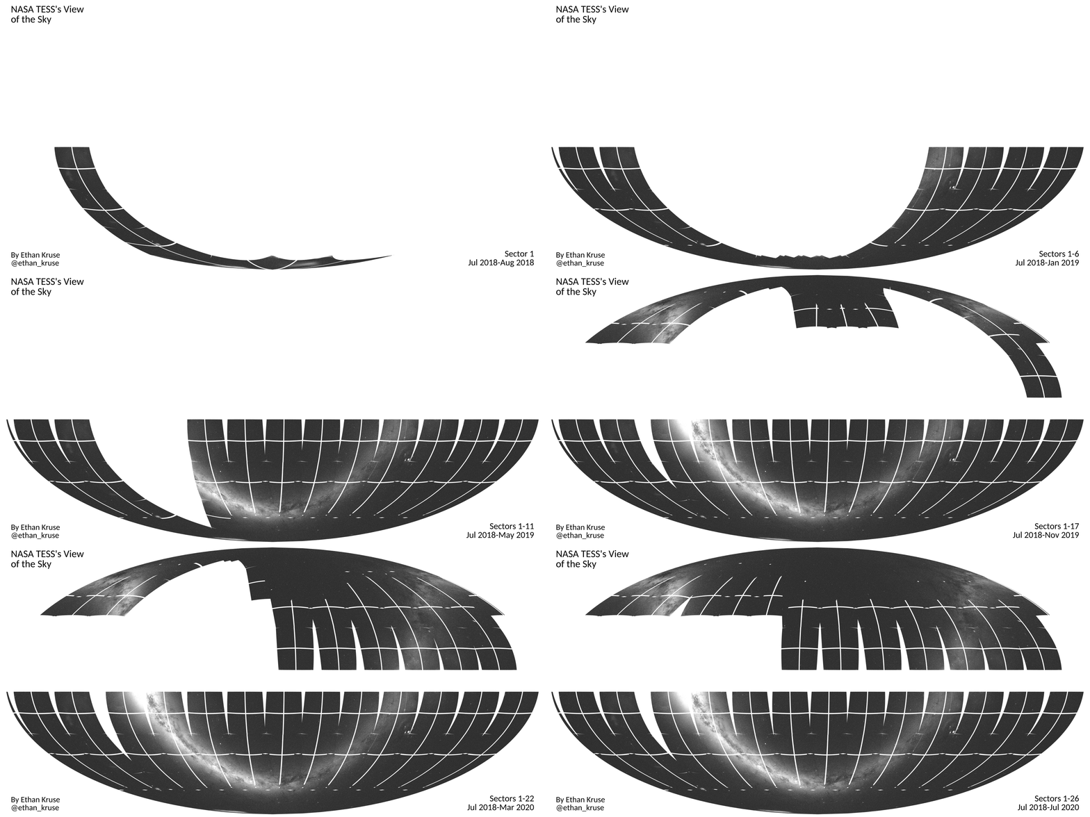
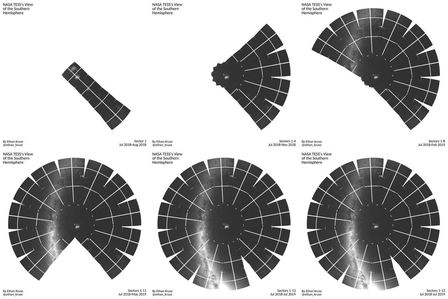
TESS's View of the Sky


NASA's TESS mission is surveying most of the sky for exoplanets, moving its field of view to a new sector every 27 days. These animations show its progress; on the top is its full view of the sky and on the bottom is TESS's one year survey of the southern hemisphere.
TESS: The Movie
This is an animation of the 13th sector of data from NASA's TESS space telescope. TESS takes an image of the same region of sky every 30 minutes for a month (one sector) to study the stars and search for exoplanets. It then moves on to a new sector and new stars. Halfway through each sector (after one orbit), the spacecraft pauses data collection to turn and send data back to Earth.
Movies of every TESS sector can be viewed on my YouTube channel.Kepler Orrery
All of the Kepler multi-planet systems (1815 planets in 726 systems as of Kepler's end of life announcement on 30 October 2018) on the same scale as the Solar System (the dashed lines). The size of the orbits are all to scale, but the size of the planets are not. For example, Jupiter is actually 11x larger than Earth, but that scale makes Earth-size planets almost invisible (or Jupiters annoyingly large). The orbits are all synchronized such that Kepler observed a planet transit every time it hits an angle of 0 degrees (the 3 o'clock position on a clock). Planet colors are based on their approximate equilibrium temperatures, as shown in the legend. Only planets from the original Kepler mission are shown; it does not include K2 planets.
A previous version of this animation was featured as NASA's Astronomy Picture of the Day (APOD). I also have a gif version available for easier embedding in presentations.
One Week of Transits in Kepler Data

This animation shows the 84 CCDs that make up the Kepler field of view. Every time a known planet candidate transits in front of its star, the planet appears on the figure at its appropriate location in the sky. The size and color the planet denote its size and approximate surface temperature, as seen in the legends.
One week of data is shown here in a 40 second loop. An immediate conclusion is that Kepler was observing around 90 transits simultaneously every second it was in operation. Another obvious feature is that the hot planets are more frequent, which is largely explained by the selection effect of their shorter periods and larger probability of transiting.
A shorter version (spanning one day and only 15 seconds in duration) can be viewed here.
